Since our client’s wishes and goals changed as they grew, we ended up creating three different websites in WordPress:
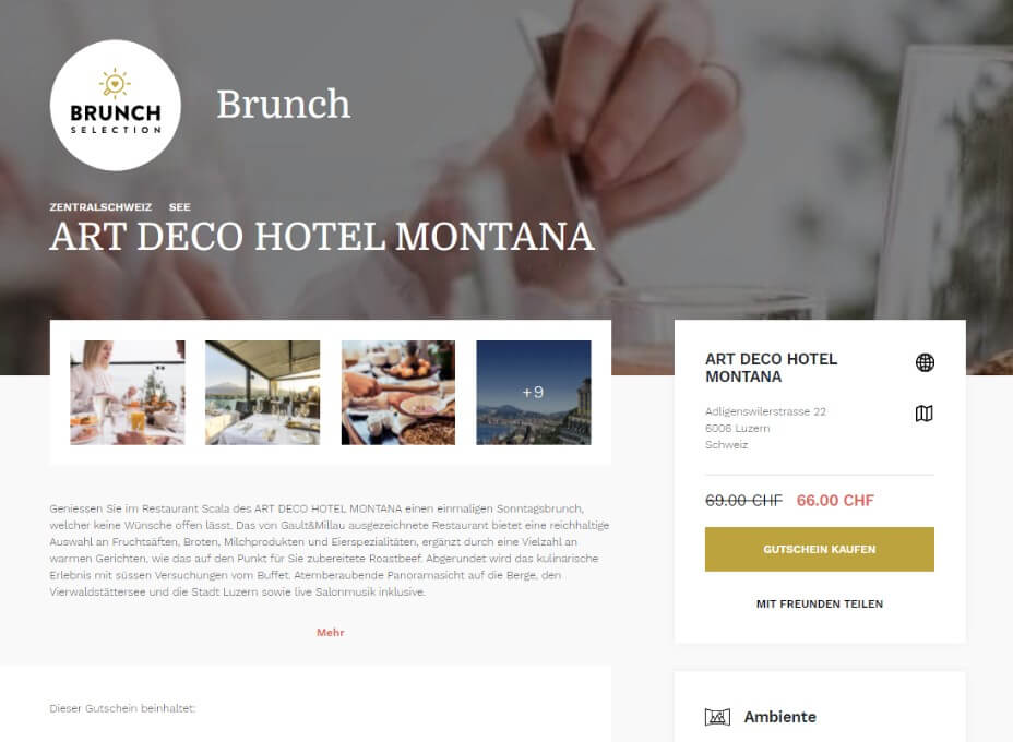
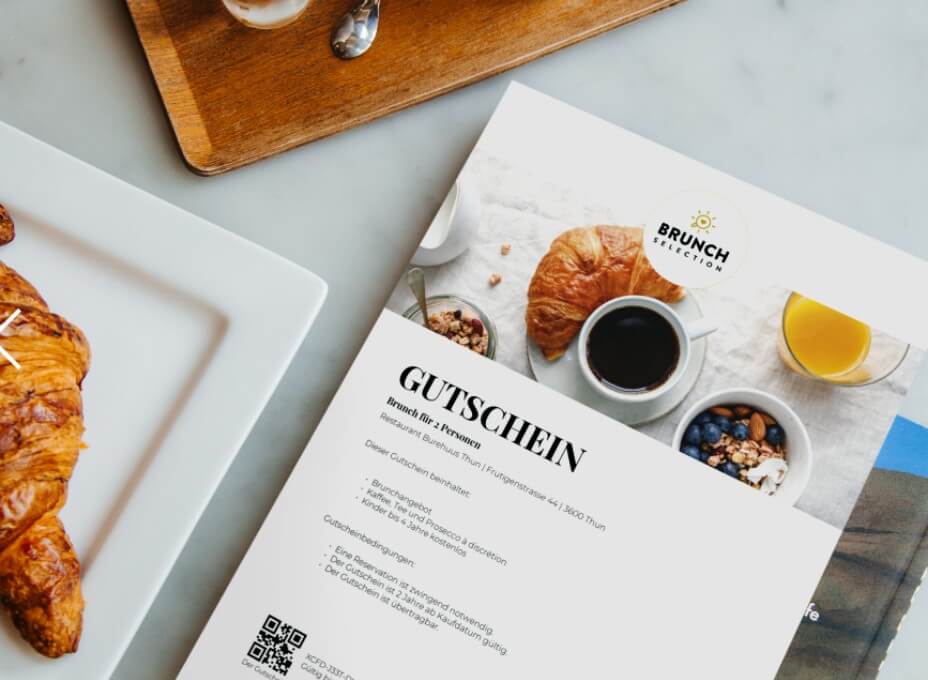
We’ve decided that it was best for customers to separate buying brunch deals and hotel deals and made two minimalistic, but visually appealing websites.
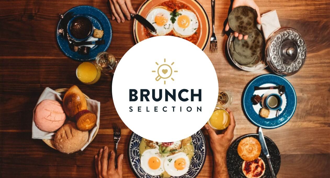
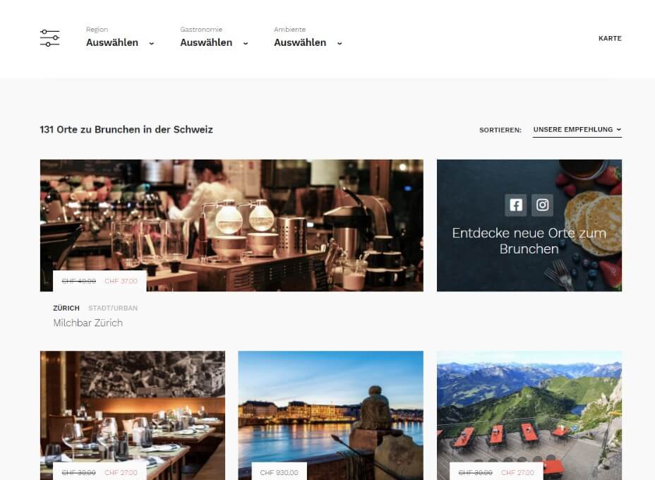
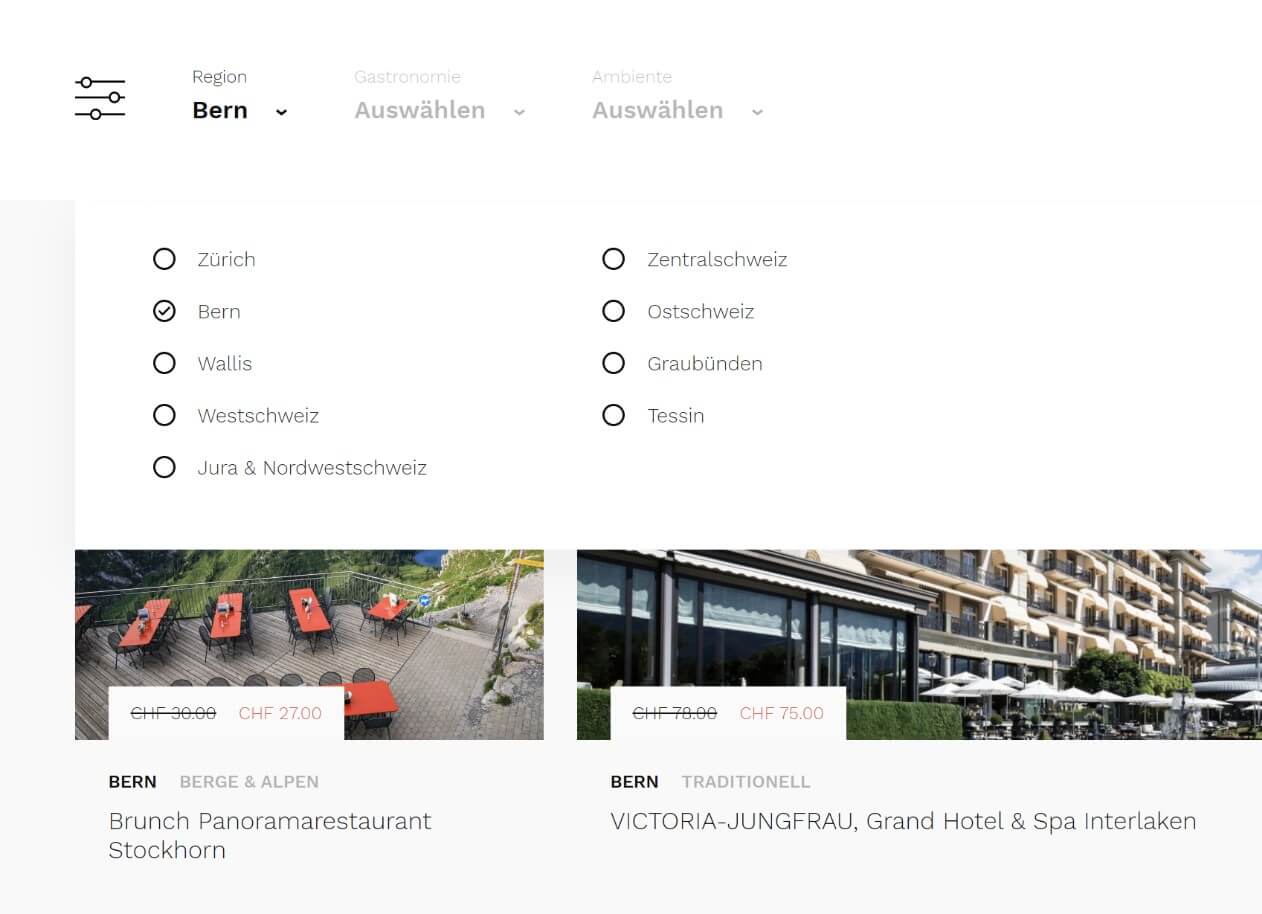
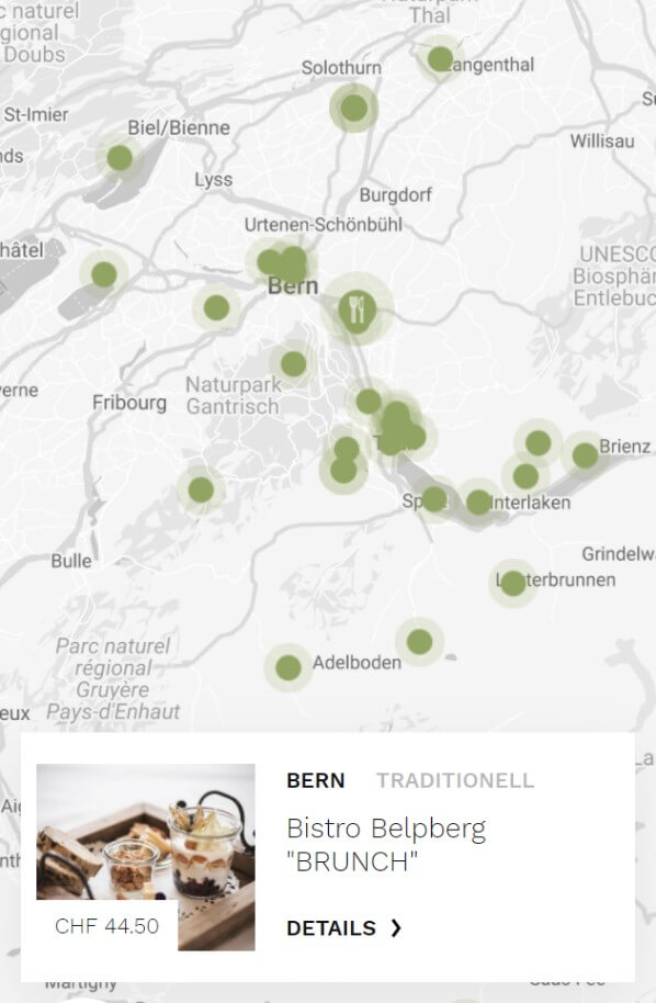
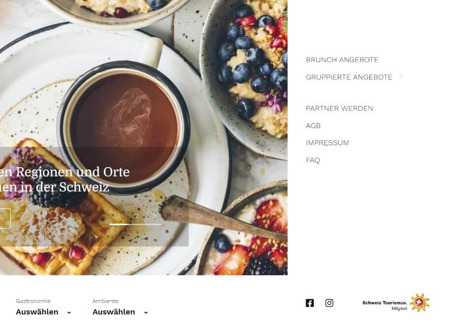
On brunchselection.ch end, visitors can feast their eyes on striking food photography and search offer using filters – region, cuisine, and ambient.
Sleepselection.ch is made in the same style, the only difference being filters – visitors can choose a hotel based on the region, accommodation-related activities, a number of stars, etc., and view it on the map.
Each website has its own CMS (Content Management System).
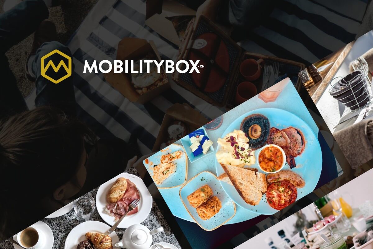
In addition, we have created a special page for MobilityBox, where users can find information about their services, partners with whom they cooperate, as well as their contact. The design of the website best reflects what MobilityBox is – modern, dynamic, and personal. A dynamic feel is achieved by a video background that shows the people of MobilityBox.


-
Instagram
-
Linkedin
-
Facebook
info@samurai-digital.com